
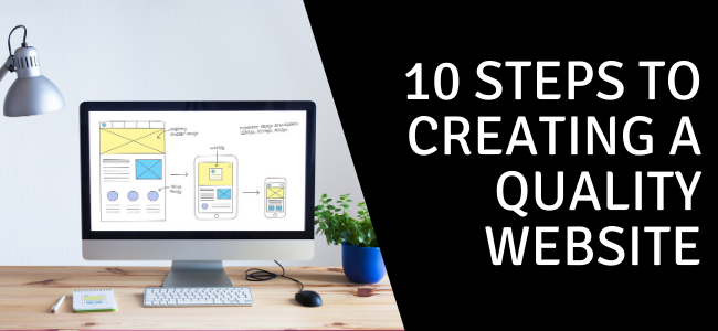
It has never been more important to craft a website that people will remember positively. Some sources (including Mill for Business) put the number of websites well over 1 billion. Here are some tips to make yours stand apart from the rest.
- Create both evergreen and topical content. Evergreen content is the type of content you can write once and, for the most part, let it just sit on your website without needing to change it often. This content can seem like your best friend. However, the problem with evergreen content is, without new pieces of content, people will stop coming to your site. After all, if you aren't doing anything new, why should they care? A good website will always supply visitors, new and returning, with fresh content. Some examples of fresh content can include tips for the holidays, shopping deals, DIY guides, new products, expansions, and new locations. New content encourages visitors to keep coming back, so they won't miss anything.
- Put your best foot forward. It's tempting to keep the good stuff at the bottom of a page, but you want to make sure you have enough interesting information starting above the fold to encourage the reader to read all the way to the bottom. Don't be afraid to put your most compelling content towards the top; this draws a reader in and encourages them to keep reading.
- Make sure your website is easy to navigate. From navigation bars to site structure, make sure that your visitor can find their way around very simply. The trickier a site tries to be, the more likely visitors will leave. Make it intuitive: people like to know what to expect when they get onto a website. Keep your navigation at the top of the page, make your logo a button that returns to the home page, and use breadcrumbs. These are all ways to make sure your user doesn't get lost on your site and click away before they've found what they're looking for.
- Design for mobile first. More than half of all web traffic now comes from phones, and Google indexes the mobile version of your site to rank it. Build your site to look and work great on a small screen first, then scale up to desktop, not the other way around. Use a responsive design that adapts to any screen size, keep buttons and links big enough to tap with a thumb, and make sure text is readable without pinching and zooming. For more, see why web design must be mobile-first.
- Make your site fast. Visitors abandon slow sites, and speed is part of how Google ranks pages through its Core Web Vitals: how quickly your main content loads (LCP), how fast the page reacts to a tap or click (INP), and how stable it stays as it loads (CLS). Compress your images, avoid bulky plugins, and test any page for free to find what's slowing you down. Our guide to testing your website's speed walks you through it.
- Make sure all pages are working. There is nothing more frustrating than thinking you've found the information you need, only to click the link and find it's broken or doesn't go where it's supposed to. Talk with your website developer and have them confirm your whole site is working properly, or use a tool like Screaming Frog to discover errors on your own.
- Make your content scannable and concise. Online, everything is fast-paced, and visitors want to find what they need quickly. Use bold text, short paragraphs, and clear subheadings so people can skim and then dive deeper where they want to. (Take this article: you can read just the bold points, or read the details under each.) Keep your writing tight, too. Cover a topic thoroughly but don't beat it to death; if a piece keeps ballooning, consider splitting it into two or moving some of it to another page.
- Make your site accessible. An accessible site is easier for everyone to use, reaches more people, and lowers your legal risk. Follow the basics of the Web Content Accessibility Guidelines (WCAG): add descriptive alt text to images, make sure the site works with a keyboard, and don't rely on color alone to get a point across. Color matters here too: keep your palette simple, with two or three colors that work well together, and make sure there's enough contrast between your text and its background so it stays easy to read.
- Encourage interaction. Ask your visitors to sign up for a newsletter, donate to a cause, or walk through your front door. Always give them something to do. We call this a "Call to Action" or CTA. Other examples include clicking on links, registering for an event, sharing something on social media, or starting a chat. All of these are excellent ways to engage with your audience.
- Make your contact info easy to find. Don't hide your Contact Us page. Make sure it's easy to find right in the navigation bar, and that it includes your physical address as well as a way to email or call you. This way, if your visitor can't find the information they're looking for, they have a way to reach you directly to get what they need. Don't forget to list your hours of operation, too!
Simple, easy, and user-friendly is best! Need a hand building or improving yours? See how we can help.


0 Comments