
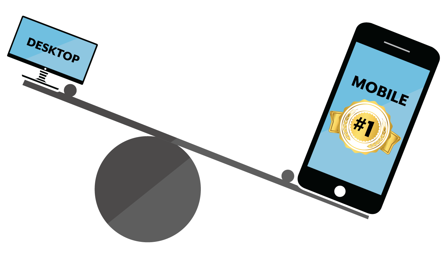
 If you've talked with an online marketing professional any time in the past decade, you've heard that more and more people interact with the web on their mobile devices. That's no longer a prediction or a trend to get ready for. It's simply how the web works now.
This article probably won't surprise you, but it's vital we all understand that the shift to mobile has far-reaching implications for your business website and how you interact with customers. There are advantages for those who build for mobile first, and disadvantages for those without mobile-optimized websites (and I say "mobile-optimized" as something more than "mobile-friendly").
There are two main reasons mobile-first web design and optimization are now non-negotiable.
Mobile Usage Passed Desktop
The first reason is that mobile usage passed desktop usage back in 2014, and the gap has only widened since. Today, mobile devices account for the majority of web traffic worldwide. That alone should get you to pay at least as much attention to your mobile user experience as you do to your desktop users.
Action Item: Pull out your smartphone right now and check out your website for two things:
1) Is it a good experience?
2) Are there effective, easy calls to action?
Google Uses Mobile-First Indexing
The second reason is that Google, the largest search engine by far, has gone all-in on mobile. As of October 2023, Google completed its switch to mobile-first indexing. That means it now uses the mobile version of your site to crawl, index, and rank it, for every website on the web.
In other words, your mobile site isn't a secondary version of your "real" desktop site anymore. As far as Google is concerned, it is your site. If your mobile experience is thin, slow, or broken, that's the version Google judges you on, and a business without a strong mobile presence risks losing the majority of its traffic and lead opportunities.
Here's what you need to dominate on mobile:
Fast Websites
Mobile users expect pages to load quickly, and they'll leave if yours doesn't. Google measures this real-world experience through Core Web Vitals, three metrics that factor into how it ranks pages:
- Largest Contentful Paint (LCP): how quickly your main content loads. Aim for 2.5 seconds or less.
- Interaction to Next Paint (INP): how quickly your page responds when someone taps or clicks. Aim for 200 milliseconds or less.
- Cumulative Layout Shift (CLS): how visually stable the page is as it loads, so buttons don't jump around under a user's thumb. Aim for 0.1 or less.
Design your site with these in mind, especially on mobile, where slower connections and less powerful devices make speed harder to achieve. It's easy to see where you stand: check any page for free with Google PageSpeed Insights, or read our guide to testing your website's speed.
Great User Experience
This should be obvious from a user's perspective, but Google is watching it too when deciding whether you deserve to rank. Intrusive pop-ups that cover the content a visitor came for? No good. Small, hard-to-read fonts? Nope. Tap targets crammed so close together that people fat-finger the wrong link? Another problem. The exact signals evolve, but a frustrating mobile experience will never get you the rankings, or the customers, you want.
Mobile-Optimized Calls to Action
This is less of a ranking factor and more of a commonly missed opportunity for conversion rate optimization. The calls to action you favor on desktop (whether that's an email sign-up or an invitation for a phone call) likely won't be the highest-performing ones on a mobile device.
Tapping a "Call Us" link on a smartphone is much easier than the desktop equivalent, while entering email information on a phone is a lot more cumbersome than on a full-size keyboard. Take that into account when planning your calls to action.
Eventually, every business has to get on the mobile-first bandwagon just to preserve the status quo. But the companies who do it well pull ahead and take advantage of the opportunities in the meantime. And if you're not trying to maximize your visitors, customers, leads, and, ultimately, profit, why did you read all the way through this article? 😉
We at i7 Marketing would love to help you craft a mobile-first, fast-loading website that turns visitors into leads. Let's talk.
This is part of our guide to marketing your small business online.


0 Comments